KCS - KINGSWAY COLLEGE REBRAND
After years of being an independent school, but also weary of using the word 'private school', Kingsway College School wanted a refresh.
The school had grown up. From the very beginning it aimed to differentiate itself from the other private schools in Toronto. It wasn't about antiquated expectations or legacy, it was about sending youth off equipped to face futures where they could explore their journey and expand the possible.
This was ultimately the creative inspiration for this rebrand.
This was ultimately the creative inspiration for this rebrand.
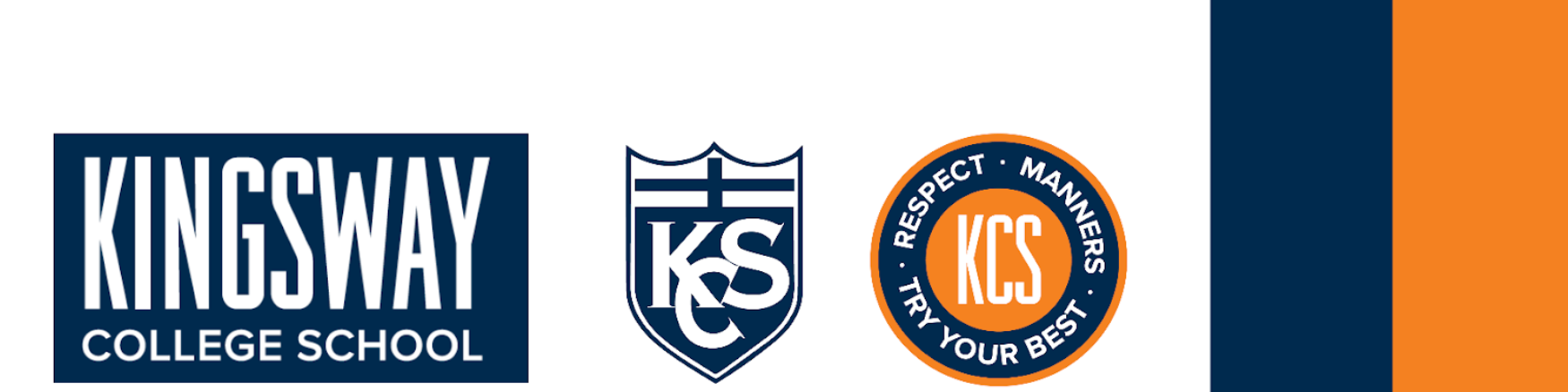
They used to have a crest - the same way every private school does. This crest was intentional, made to stand up to the century-old private schools in the area. But they soon learned they were different, more contemporary in their thinking, teaching and therefore, their 'look' had to reflect that. They were also expanding their school from K-8 to high school which meant a new modern campus, and a 'cooler' vibe.
This is where my branding experience was called upon by Art & Science agency.
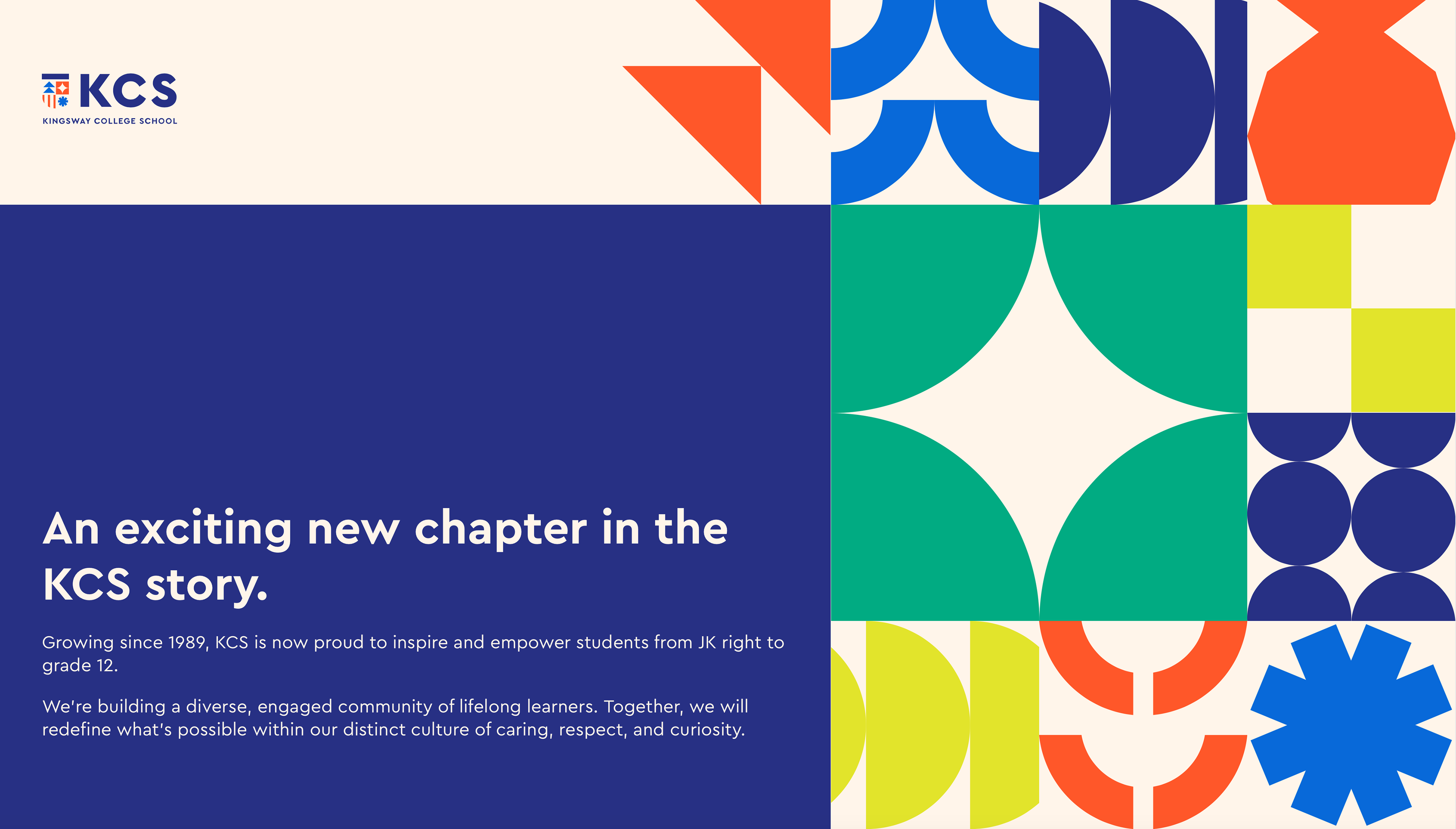
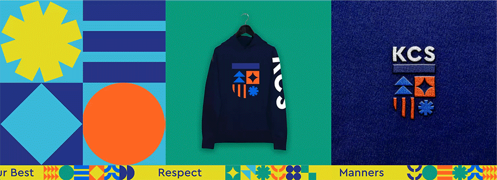
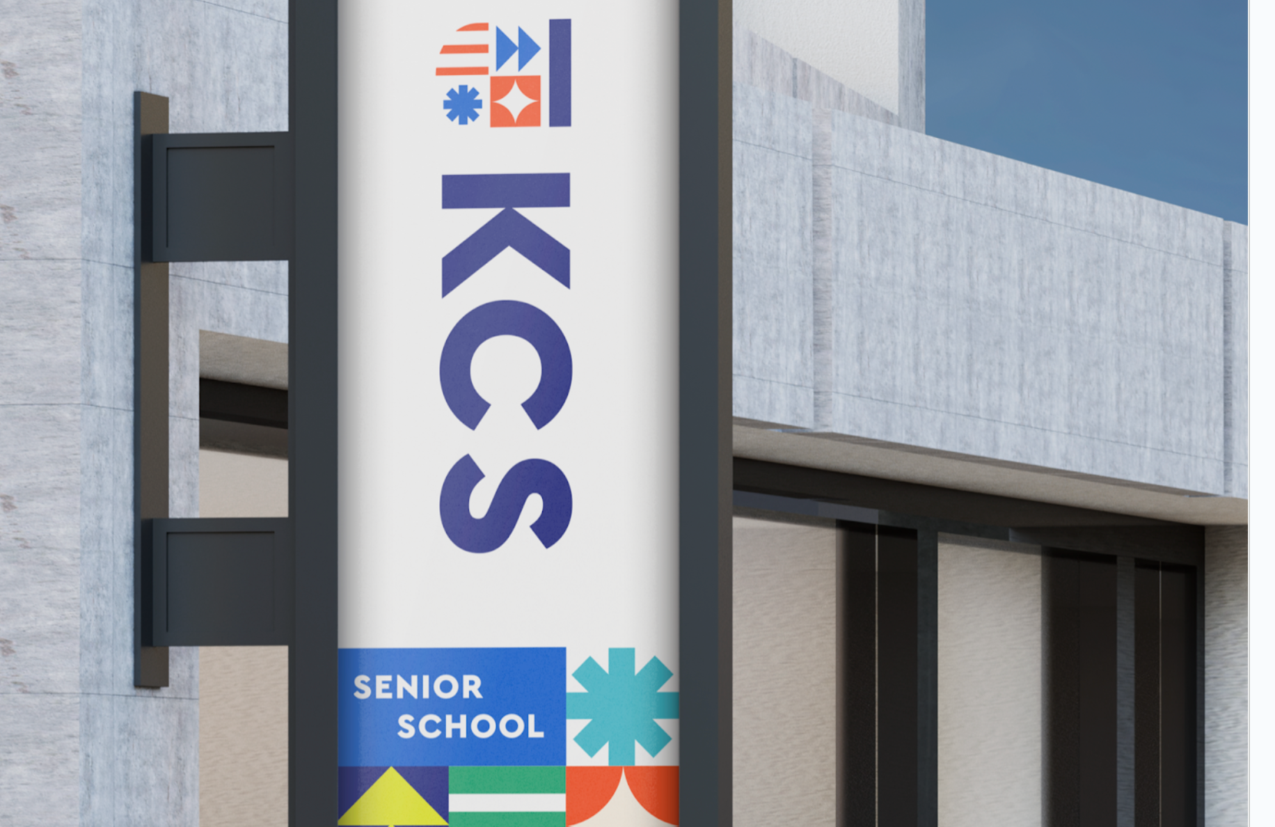
Together with their strategy team, we came up with the idea to modernize the whole notion of a crest. Let's take away the antiquated, stuffy persona and make it modern while pulling from their school values. What they call the 'Four Doors'.
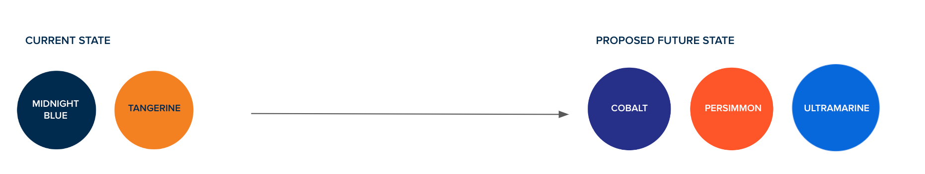
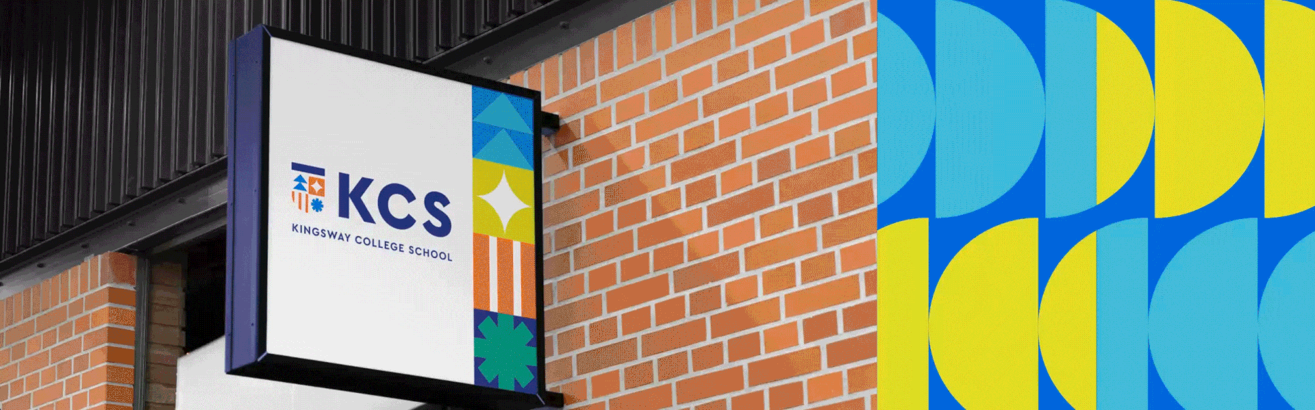
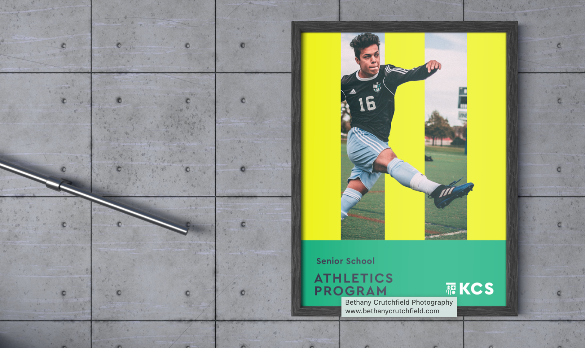
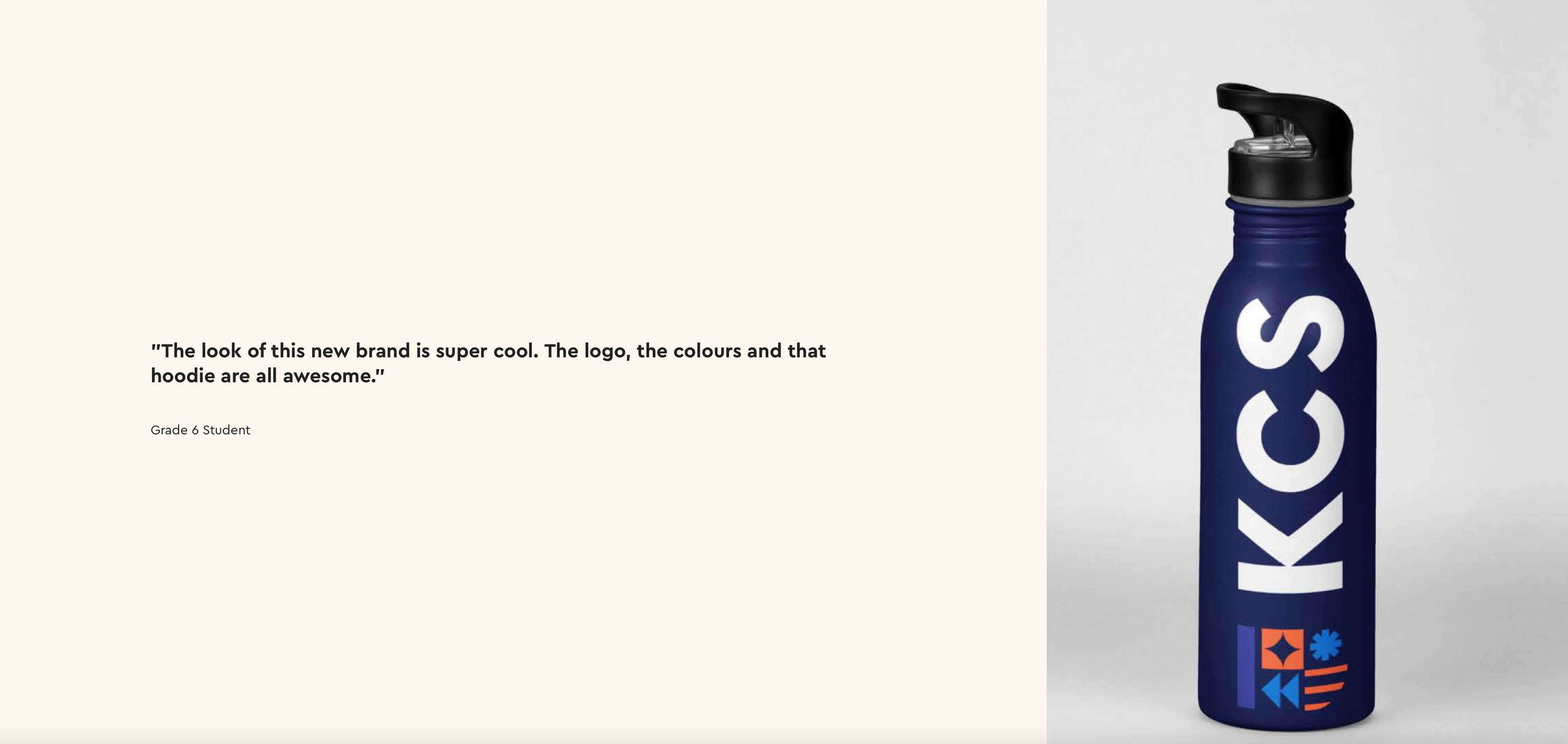
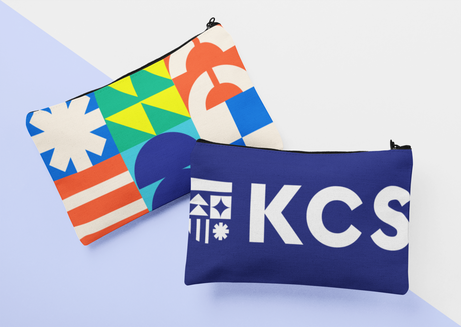
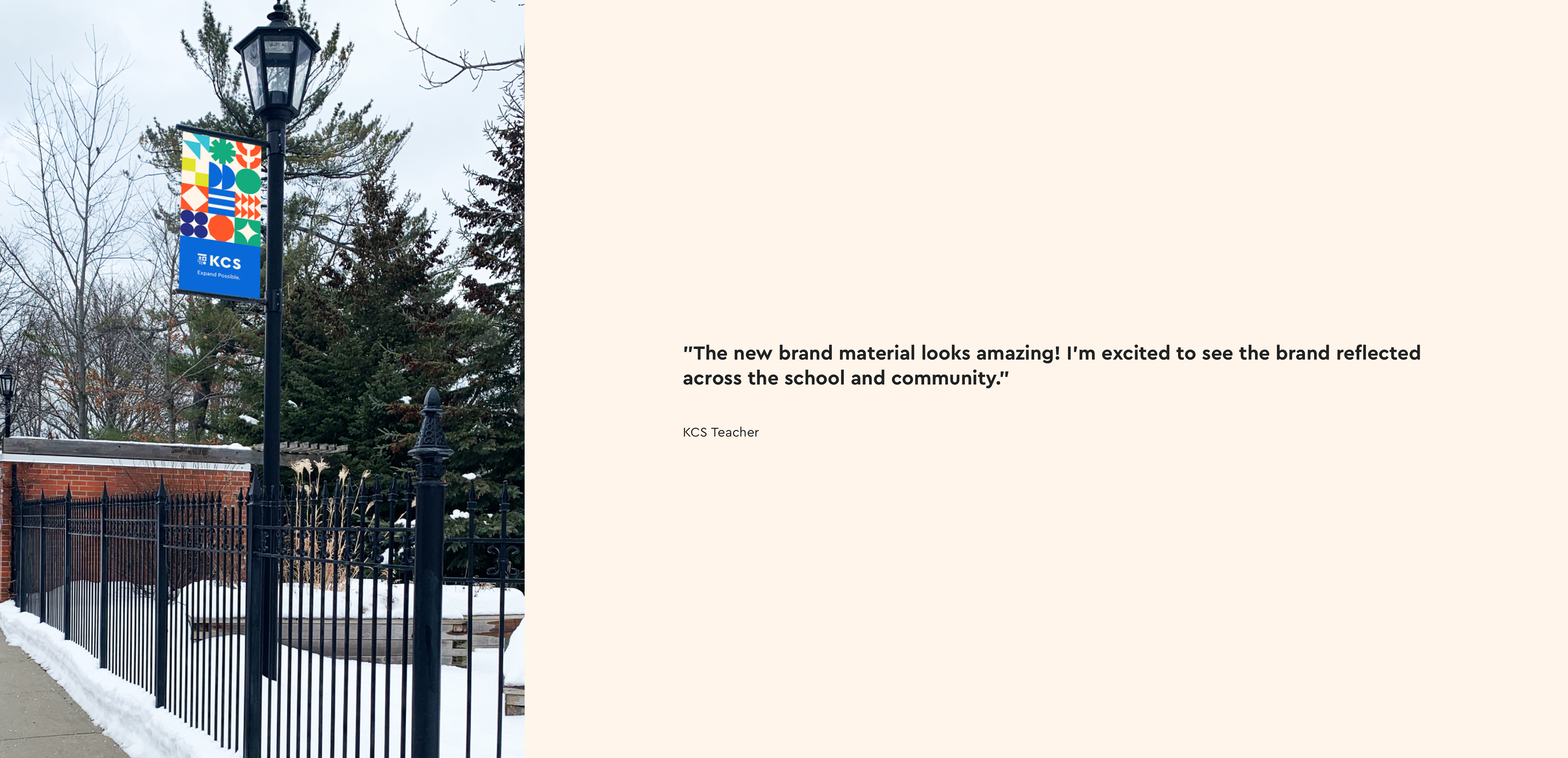
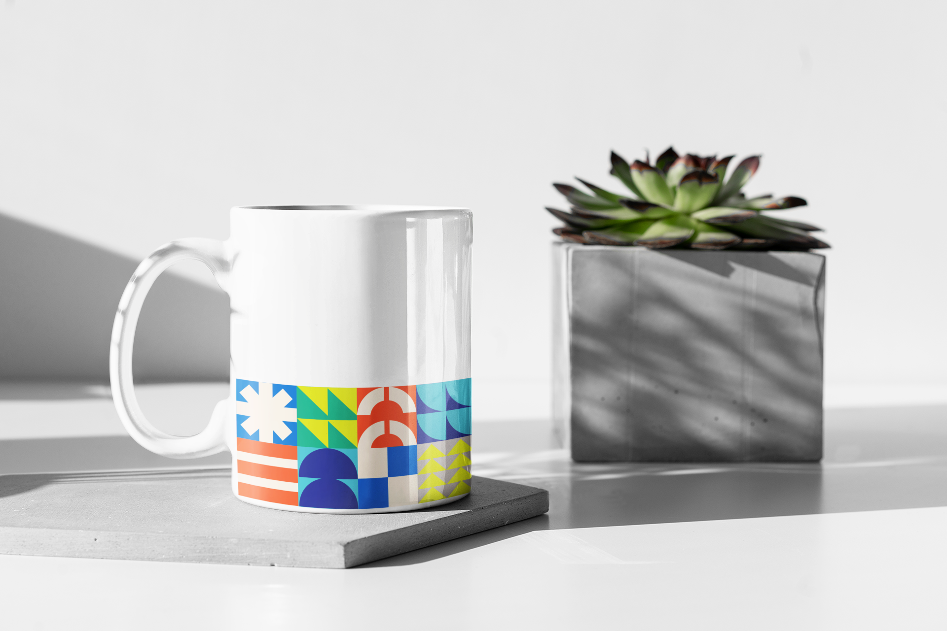
We updated the colour scheme, well as created a visual language that stemmed from the symbols in the crest and created something that was all their own.
This is where my branding experience was called upon by Art & Science agency.
Together with their strategy team, we came up with the idea to modernize the whole notion of a crest. Let's take away the antiquated, stuffy persona and make it modern while pulling from their school values. What they call the 'Four Doors'.
We updated the colour scheme, well as created a visual language that stemmed from the symbols in the crest and created something that was all their own.
Welcome to the new KCS. Expand possible.
Credits: Creative Direction & Design: Lisa McCoy, Strategy: Art & Science,
Credits: Creative Direction & Design: Lisa McCoy, Strategy: Art & Science,

THIS WAS THE OLD LOGO AND CREST. WE TOOK THE BLUE AND ORANGE AND UPDATED THEM, AS WELL AS FONTS COLOURS AND SYMBOLISM.