"Alliance Française was founded in Paris, France in 1883 by Louis Pasteur, Ferdinand de Lesseps and Jules Verne and established in Toronto since 1902. Alliance Française Toronto embodies the modern values of humanism and a respect for linguistic and cultural diversity." *
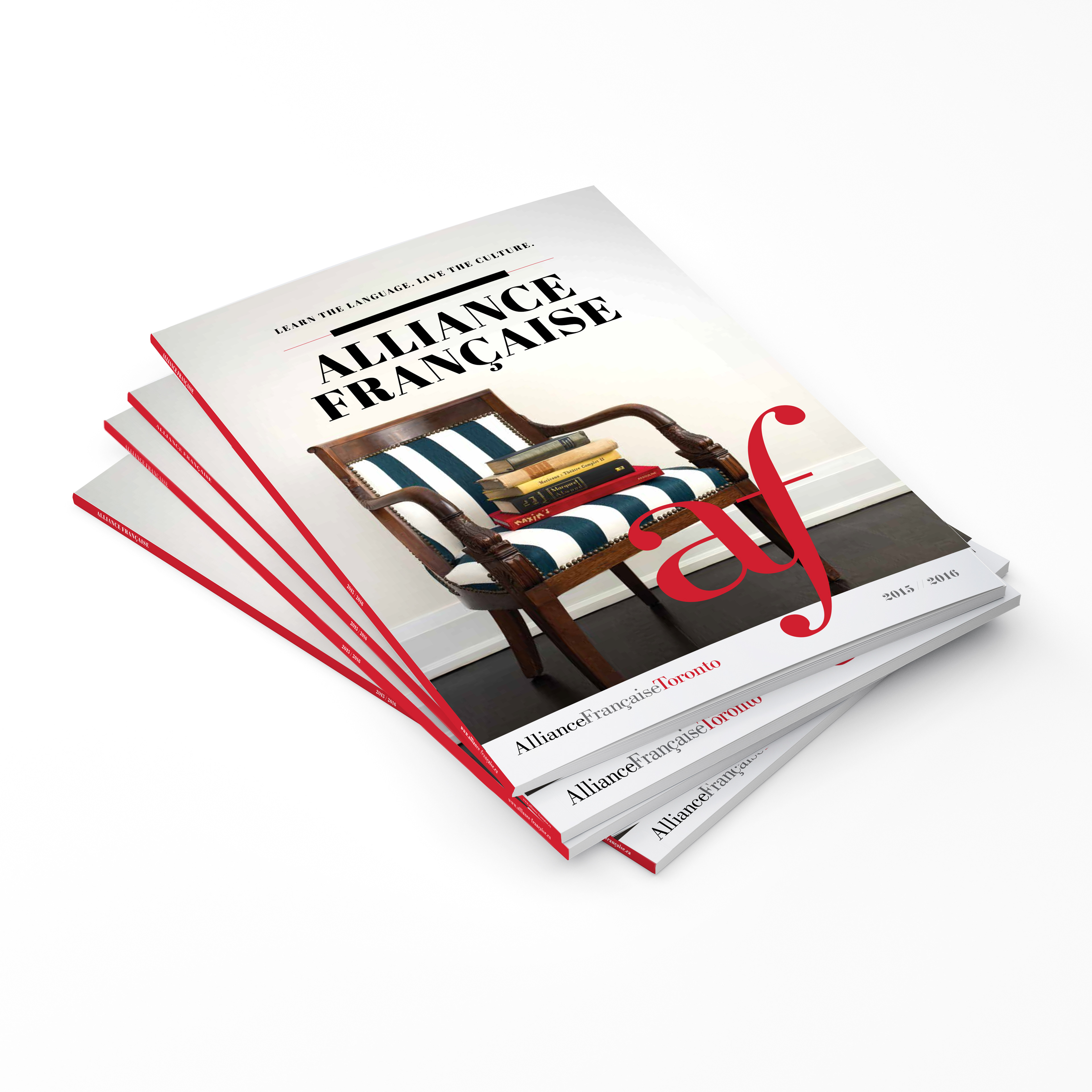
The Alliance Francaise is in over 130 countries worldwide and the Toronto division approached our agency because of our unique cross-cultural experience. It needed a new bilingual brochure to explain it's main services and postioning - it's a place where you can take french courses, with the added benefit with a full cultural program including an in-house gallery and theatre which celebrates music, art, film etc. The previous year's brochure was well...just that – a brochure. We decided to highlight their content in an editorial magazine-style which would not only encourage people to pick it up, read it, but also to keep it. This included a full cultural program which was divided into 5 themes, an overview of their education services as well as a calendar of cultural events that folded out from the back cover so that it could always be on hand. Overall a huge success at their publicized cultural season launch.
• excerpt :www.alliance-francaise.ca
Credits: Agency: Transcend3. Co-Creative Director: Olivier Tran.
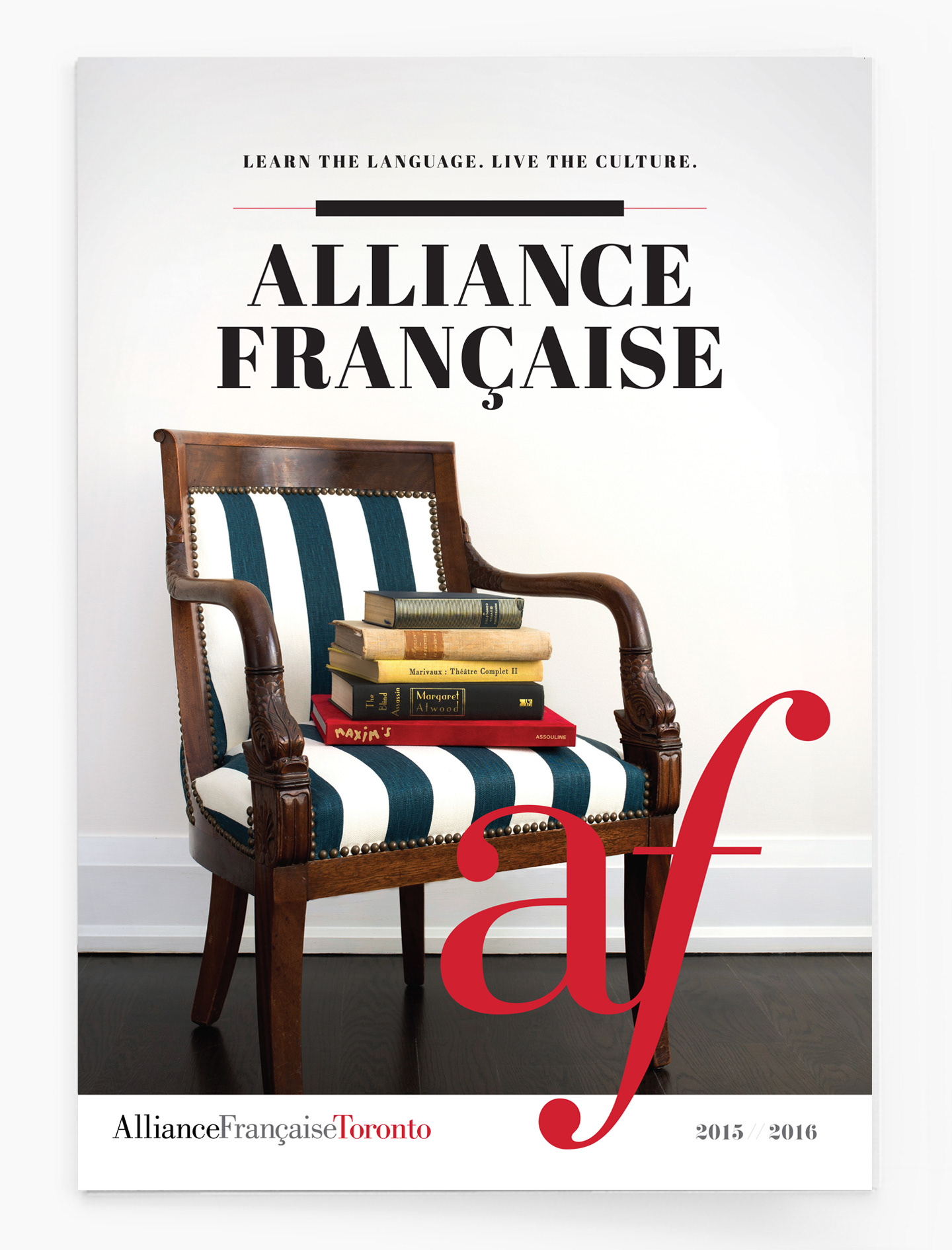
Cover of magazine - photoshoot: shot by Kristin MacKinnon. www.kristinmackinnon.com

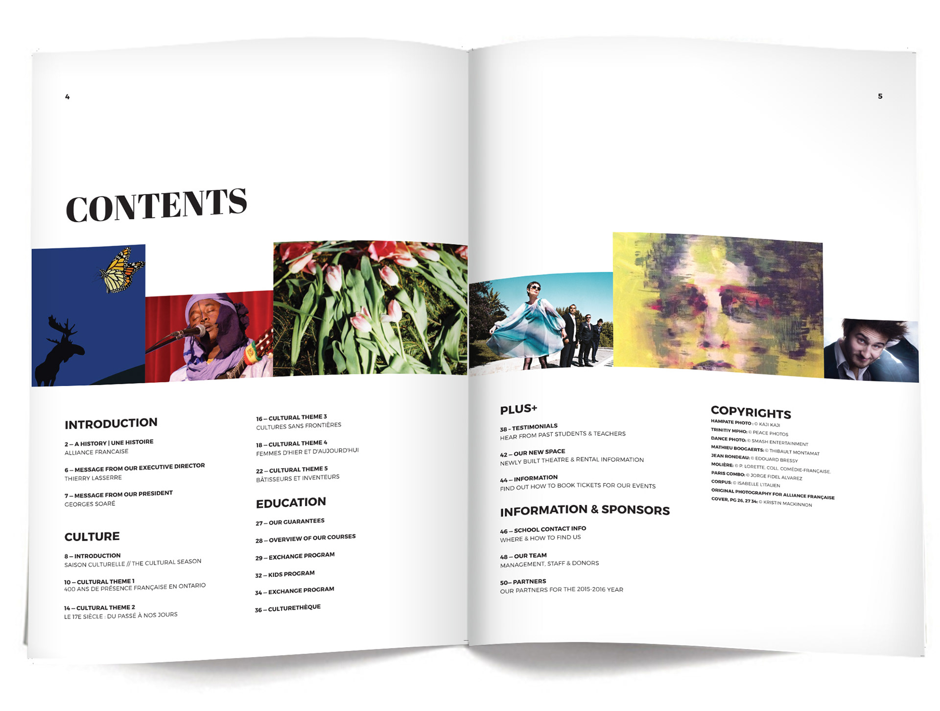
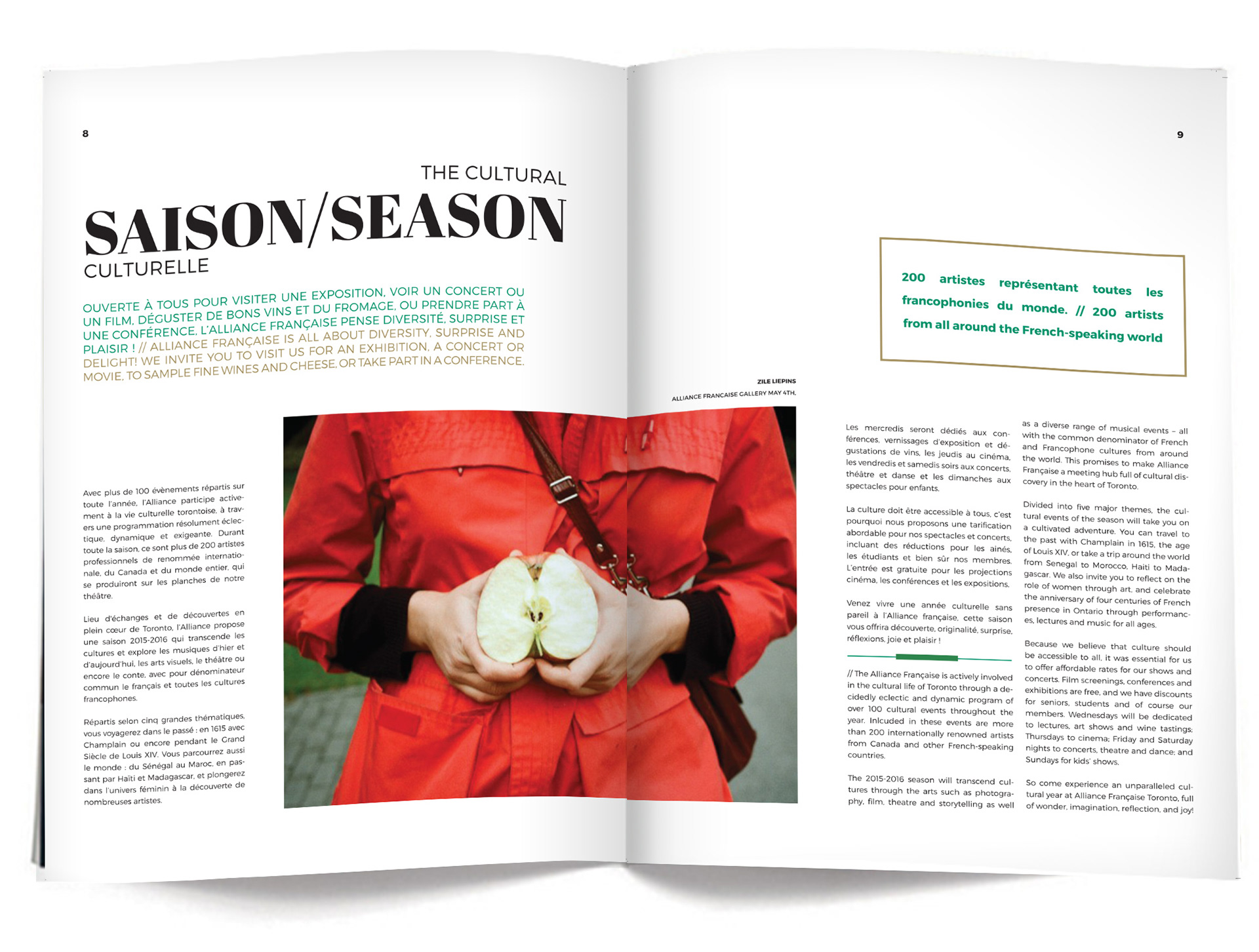
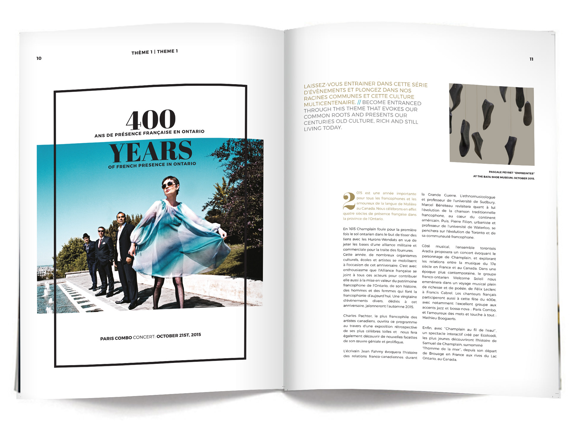
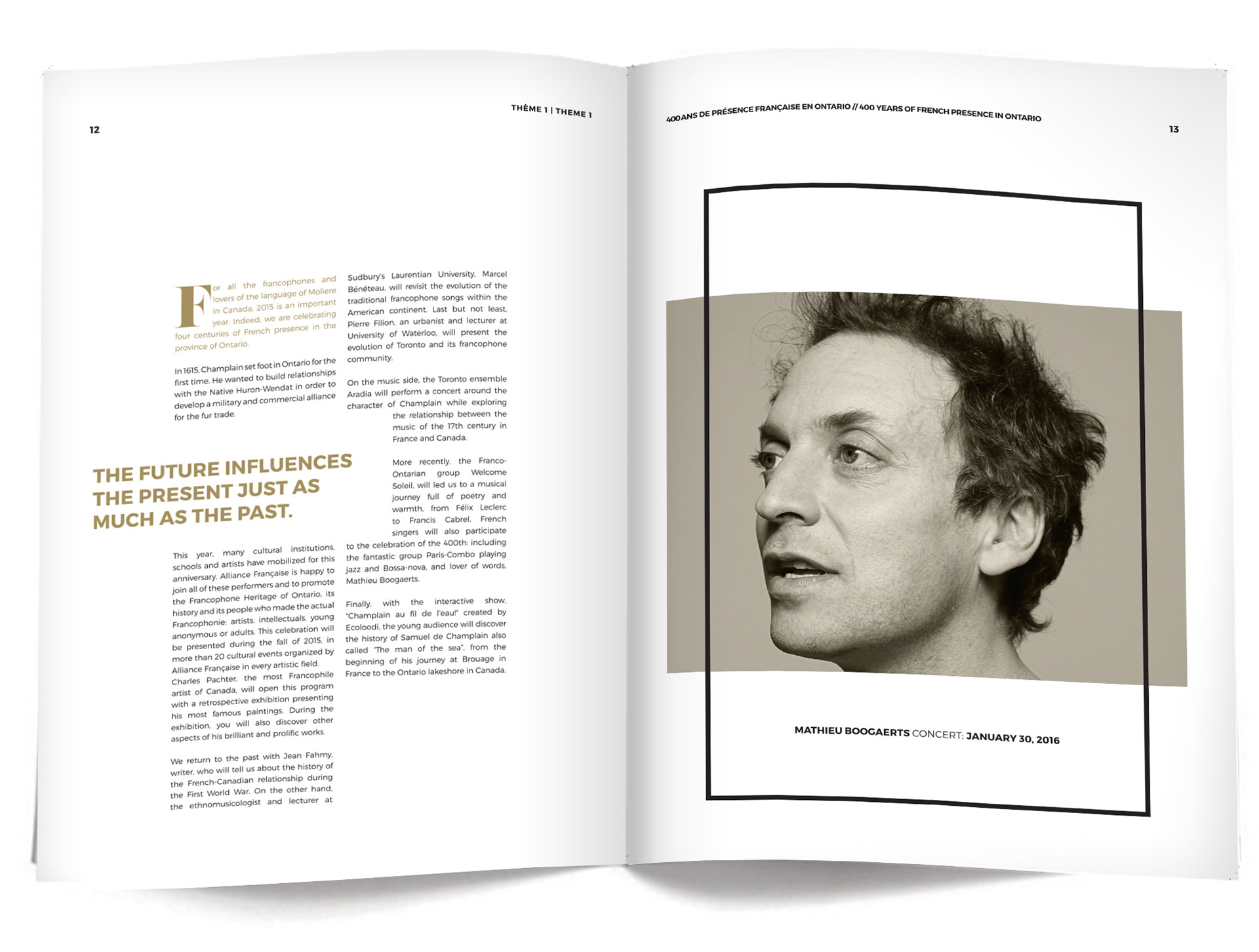
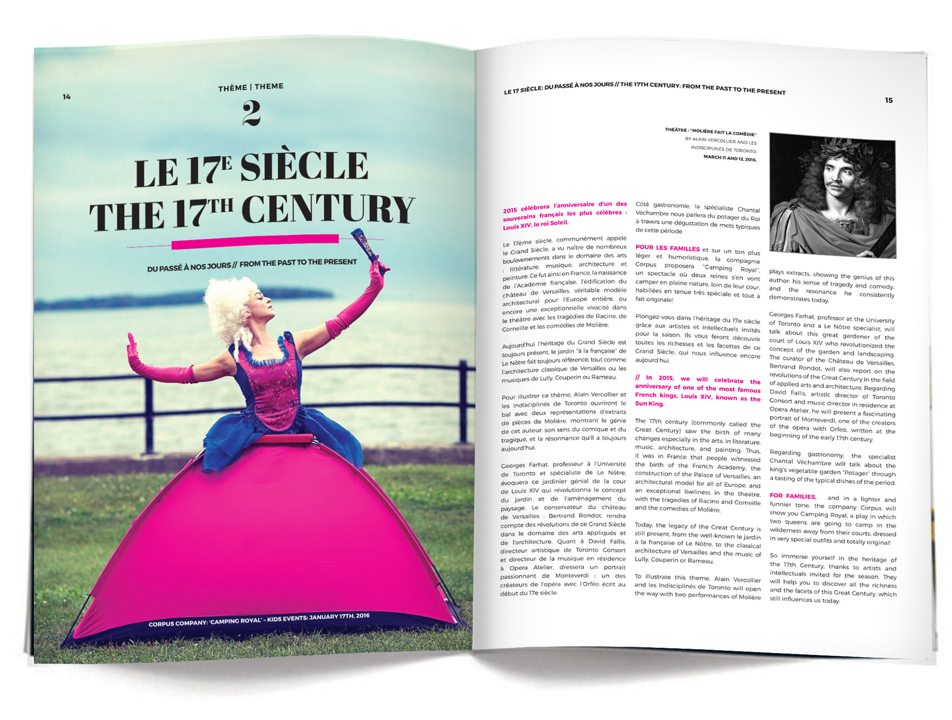
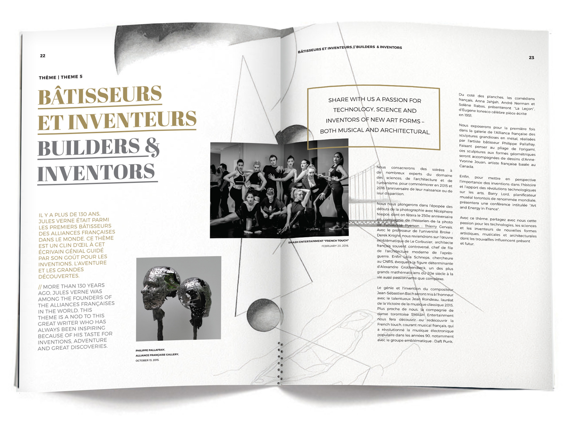
Introduction to the main cultural season which was divided up into 5 themes which included various artists, musicians, photographers etc.

Photoshoot: shot by Kristin MacKinnon. www.kristinmackinnon.com
Photoshoot: shot by Kristin MacKinnon. www.kristinmackinnon.com
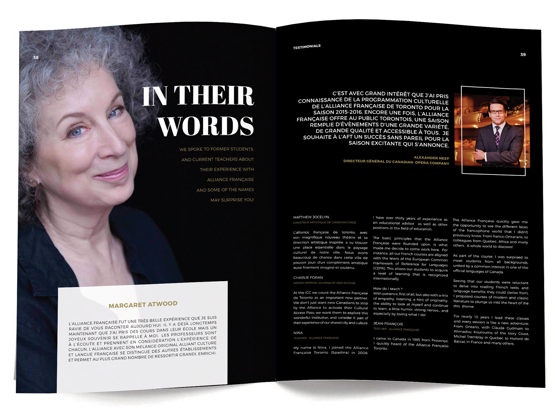
A testimonial section which had previously included just written quotes was turned into a 'story' with some famous Canadians who have taken French courses at the AFT including Margaret Atwood.
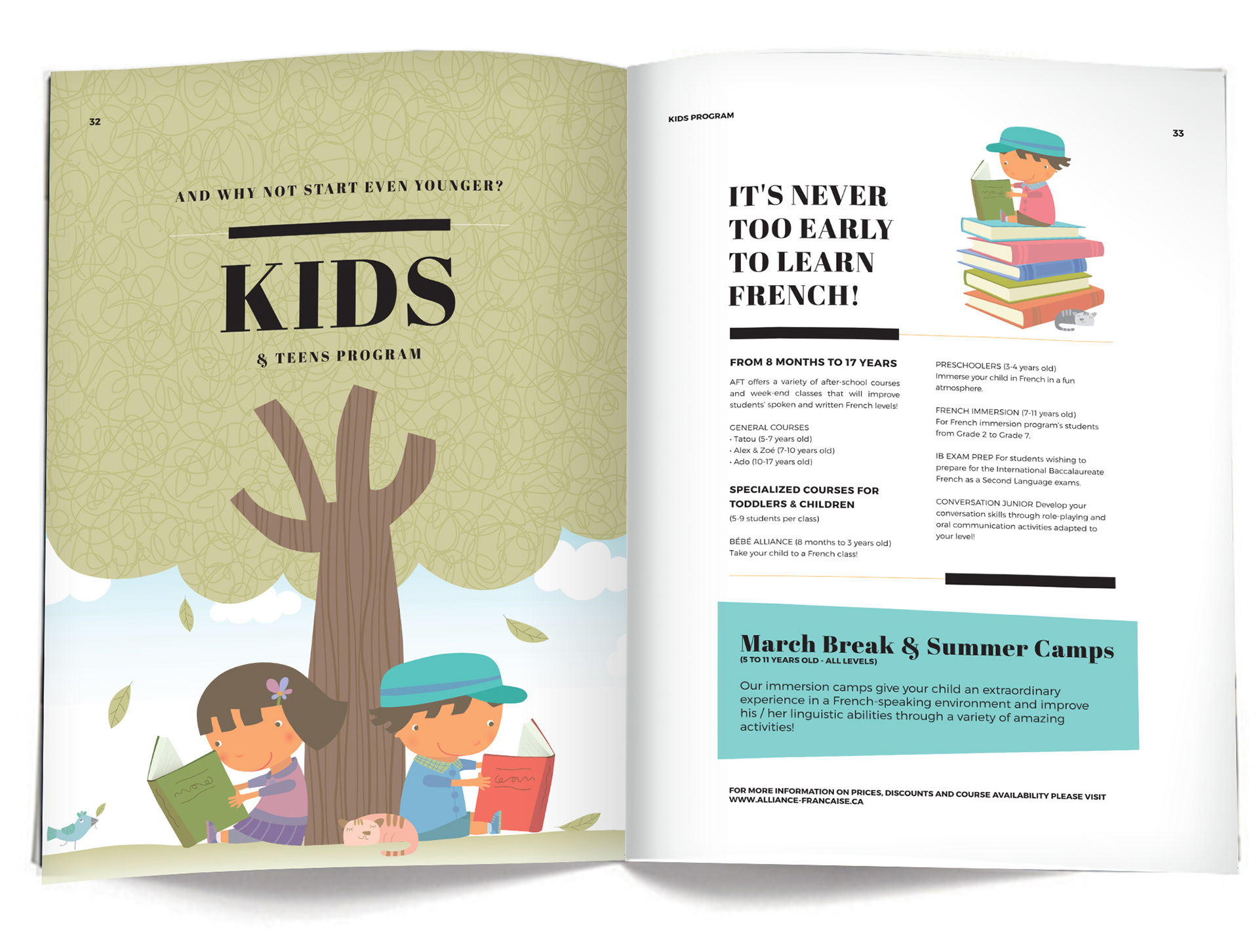
Spread highlighting the kids learning program which starts at 2 years of age.

The ask for a full cultural calendar including descriptions within the page count was definitely a challenge. We decided for numerious reasons to have it fold out from the back cover. That way it would always be on hand.
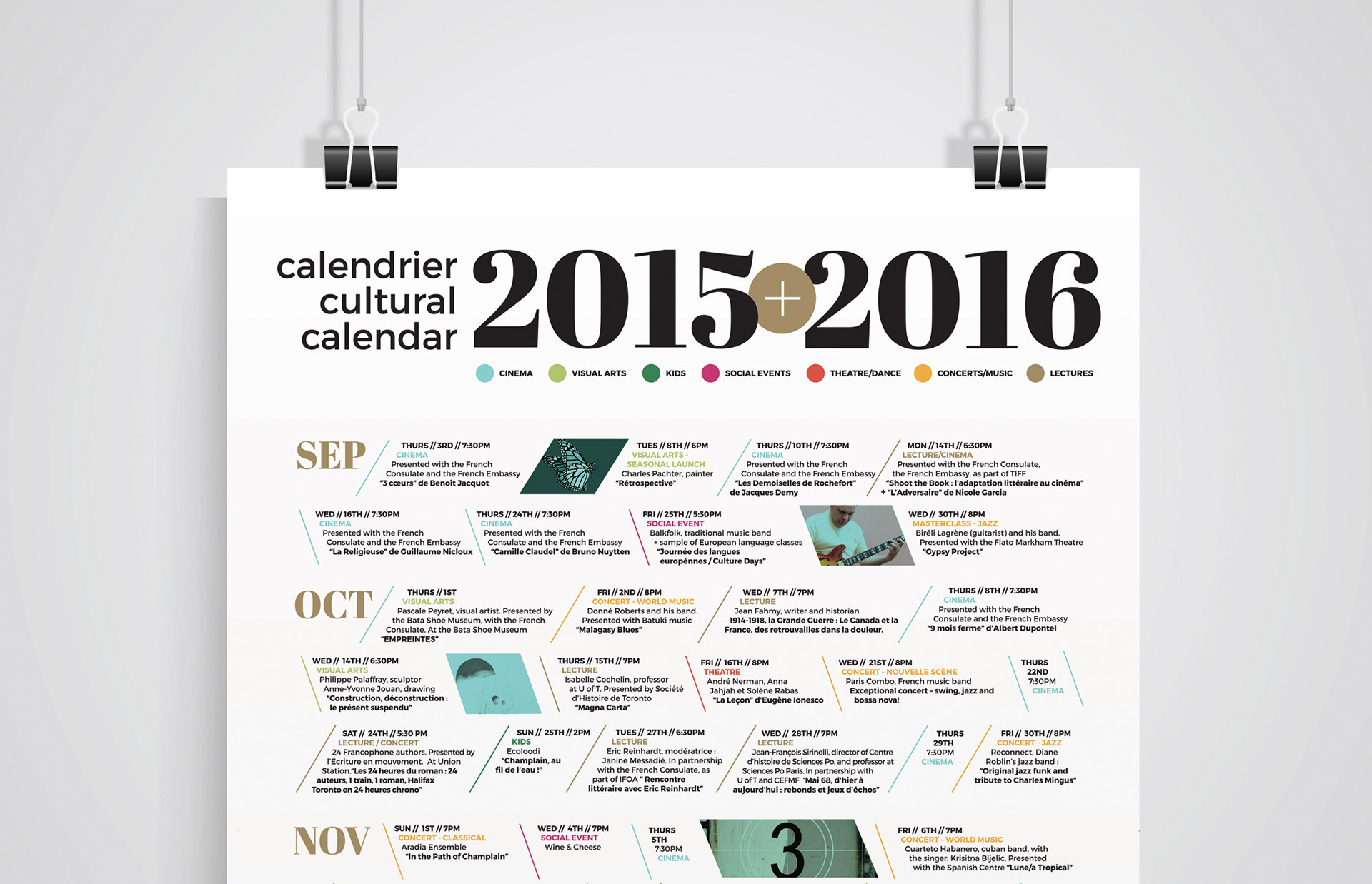
As opposed to the usual calendar the unique layout allowed for visual interest, and was also colour coded based on the type of event - ie. film vs. lecture vs. kids event etc.
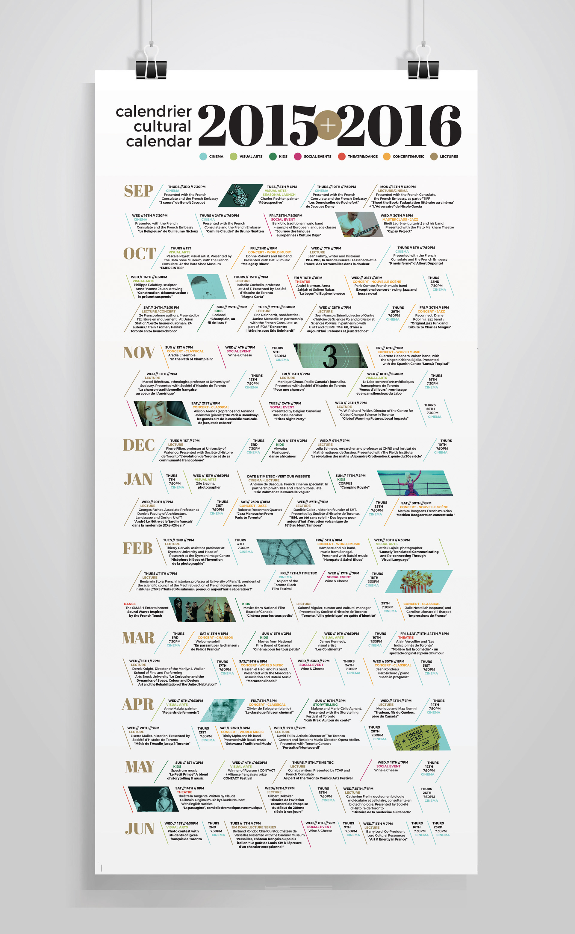
Here is a full layout of the calendar in flat version. The hope was that if it is taken from the magazine ti could also be used as a poster on a fridge door for easy access and still be visually pleasing. Each event has the date, time, some have photos of the events and all have the corresponding colour code for a quick reference guide to what's happening each month.